KYE
KYE
DESIGNS
DESIGNS

Background
FastEditor is a white-label, photo personalisation editor used by retail platforms to enable customers to design and customise printed photo products at scale. The original core experience of the photo editor needed a refresh to support a wider range of product complexity used by partner photo service platforms. The existing experience did not differentiate between more simple and complex user needs, making the editor difficult to navigate across more complicated product creation flows. While the editor had evolved rapidly to support immediate needs for partners, it had been done without a design-informed strategy practice in place. This resulted in inconsistent patterns and usability gaps across photo product types, creating the need to rethink the editor’s structure to reduce cognitive load, improve discoverability, and deliver a more intuitive end-to-end experience for customers personalising photo products.
My role
I led the redesign of the white-label editor experience while collaborating directly with HEMA stakeholders to improve their online photo product editor experience across desktop & mobile. By introducing a design thinking approach, I conducted mixed-methods research to uncover usability concerns and opportunities for refinement that eventually led to the strategic direction, roadmap and redesign of the editor based on product complexity. I also audited existing editor flows across 6+ photo product categories, 50+ products, refining and crafting new product features from exploration to implementation delivery.
OUTCOME
Delivered a scalable editor foundation supporting simple, intermediate, and advanced product complexity across multiple photo product categories. Developed both dark and light themes to support different modes and refined the editor ux/ui to improve clarity and usability, aligning with industry-standard interaction patterns while applying HEMA’s brand guidelines to deliver a cohesive, on-brand customer experience.
DESIGN PROCESS
Working as the sole designer at an early-stage company presented both personal and professional challenges. The role required navigating high levels of ambiguity while initiating processes and documentation from the ground up as the product evolved. A critical part of my work was developing an understanding of legacy design decisions and existing flows in order to evaluate tradeoffs, balance constraints, and apply sound design judgment when introducing change. This approach ultimately laid the foundations for an initial design system. Beyond the core redesign, I supported all design needs across the product, including research, UX/UI, branding, marketing, and website design, resulting in a wide range of work that live scattered throughout my design files today.
understanding the constraints
Initially, I was provided the following needs and constraints:
interface must be able to scale across many product types
application of HEMA's brand and visual guidelines (consider scalability with other white-label partner integrations)
preservation of existing functionality to ensure continuity for a large customer base
Underlying question of..
How might we reduce friction in the editor experience while keeping it simple, fun, and functional?
Research
Through a blended mixed-methods research approach of user interviews (touching 3 product categories), usability testing and observations (across 5 product types via Mouseflow), competitive benchmarking and user flow audits, I evaluated consumer motivations, and uncovered any blockers, pain points, and gaps of refinement opportunities that existed in the current editor experience.


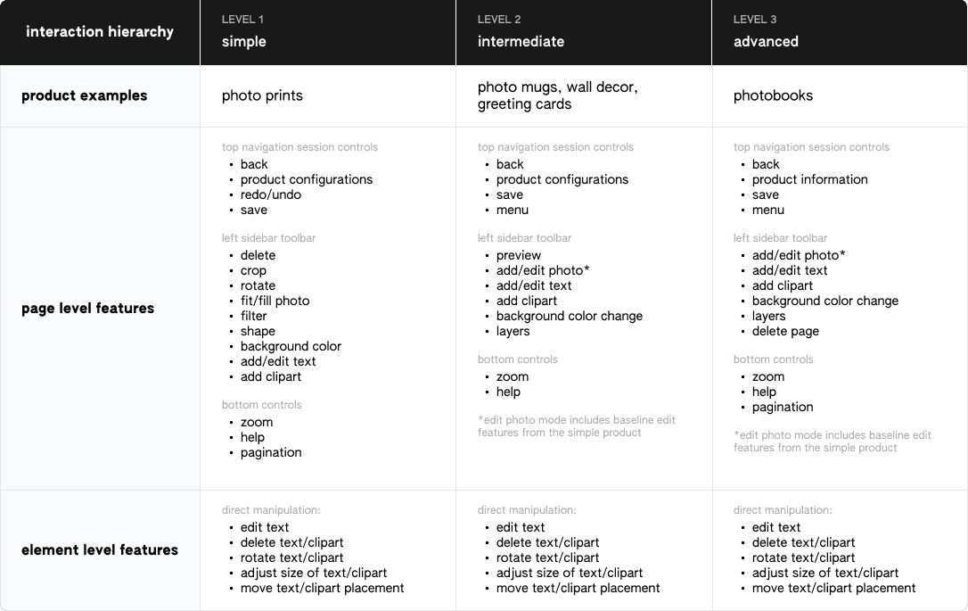
Undergoing this process was also important to help understand the internal workings/feature structure of the editor and the complexity it lies in differentiating between the layers of interaction hierarchy across page level features vs. individual element features. By understanding this separation, I was able to understand the existing conditions and design patterns to improve the baseline functionality in what needs to be held constant vs. what were the changing attributes by product type. I clustered the findings based on specific feature aspects and worked with the team to develop a roadmap to prioritize design improvement between immediate priority areas vs. for later/future consideration.
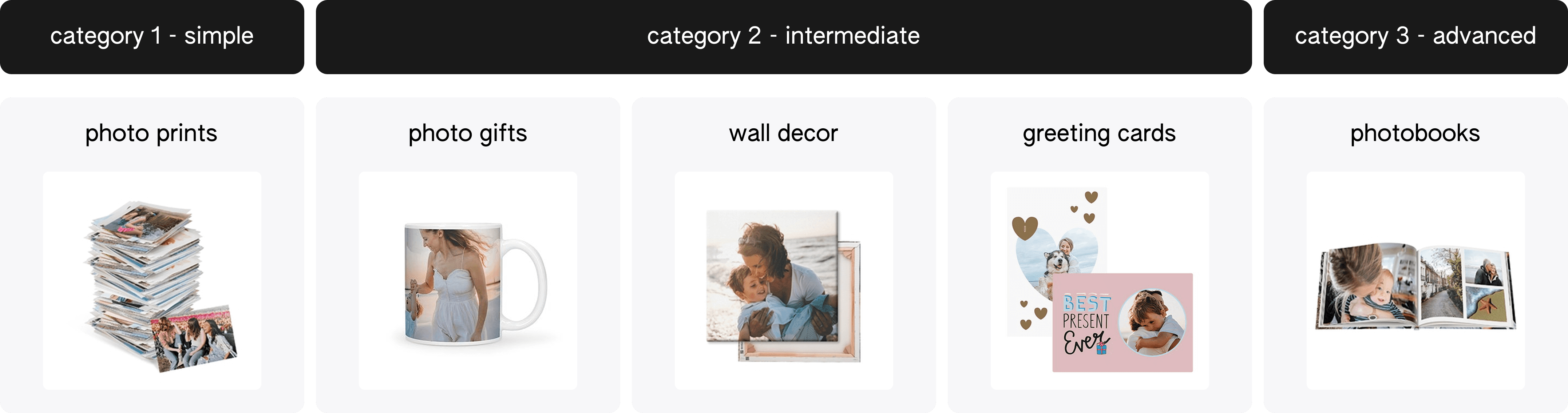
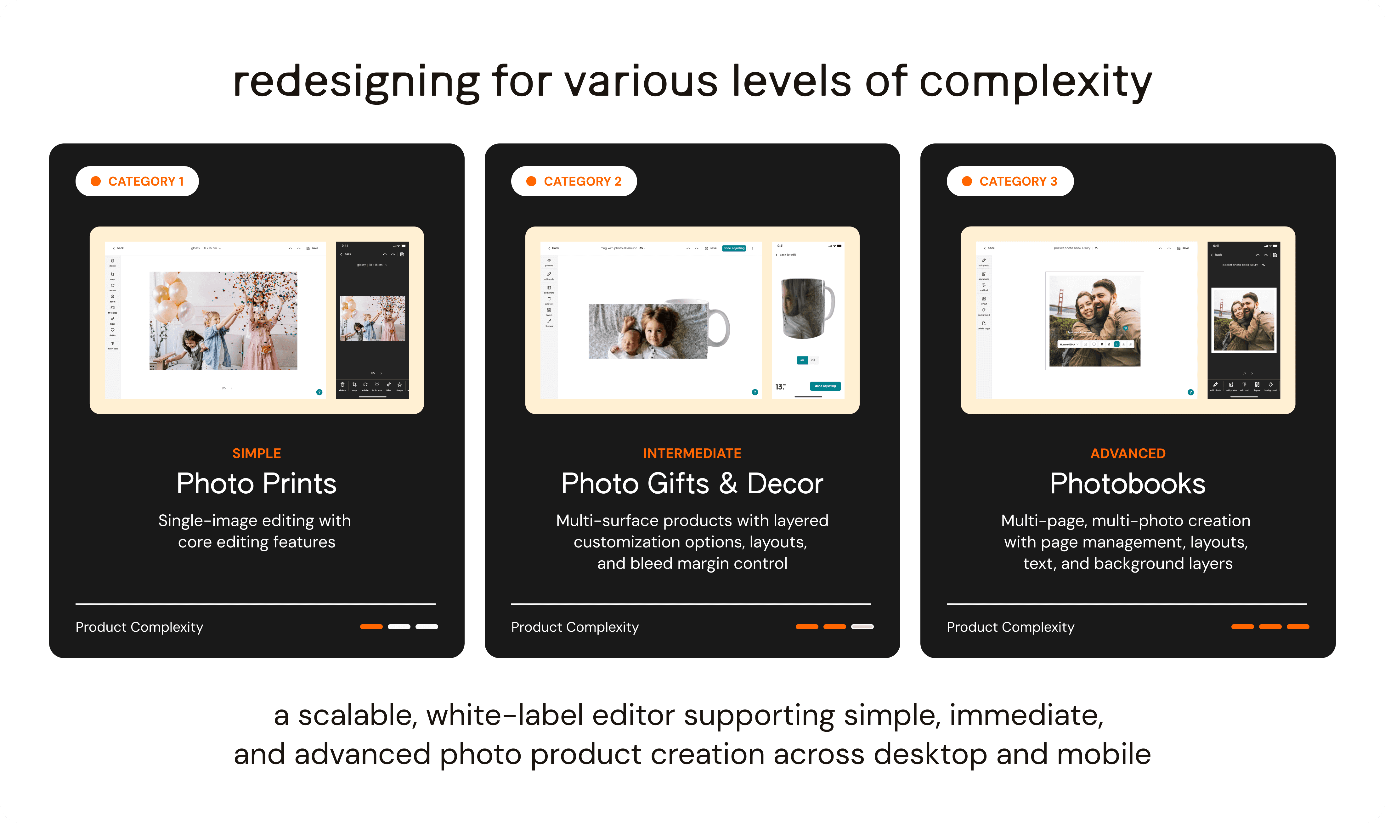
This led to a product strategy to create a simplified baseline editor into 3 complexity levels — simple, intermediate, and advanced where features are tailored to the specific product category that falls into each of the levels. This was a proactive approach to meet needs of both types of users (users with basic editing knowledge and users with more advanced knowledge) that simplifies the interface but embraces flexibility to allow for any changes in feature offerings and configuration options based on the product type.
A common pattern that was uncovered with other editors was that they used two editor designs to separate between photo prints (simple) and photobooks (advanced) products, so this was a more streamlined approach to reduce user disconnect and confusion to operate 2 separate editors especially with photo print customers as a large primary consumer base. The simple editor interface could serve as an introduction to help customers be acquainted with the editor prior to making other complex products.
Ideations and iterations
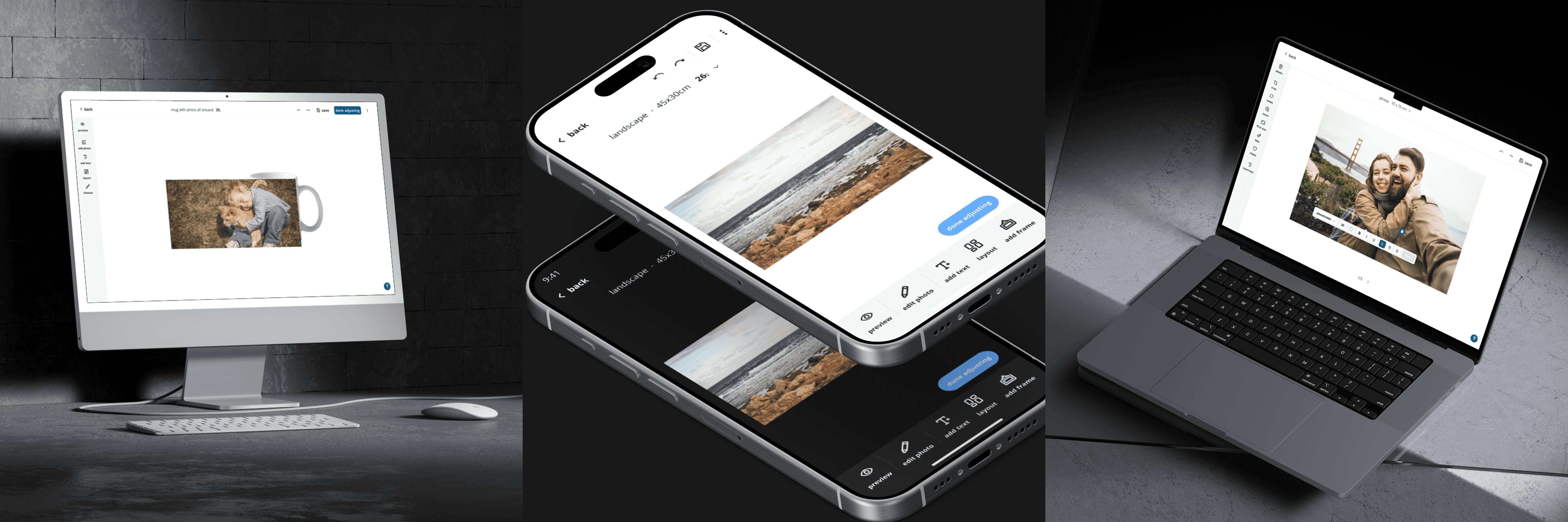
Key findings from the user interviews and usability observations indicated the largest friction point was the hidden menu that impacted discoverability of the edit features with other functions such as editing text and making direct element changes that were confusing and not intuitive to use compared to users' mental models of the same features in different applications. This feedback was incorporated into the first of many ideations and iterations to the editor interface. I used a modular-style approach to create the foundational landing canvas of the editor with interchangeable elements on the top bar, side menu tool bar, and bottom bar.
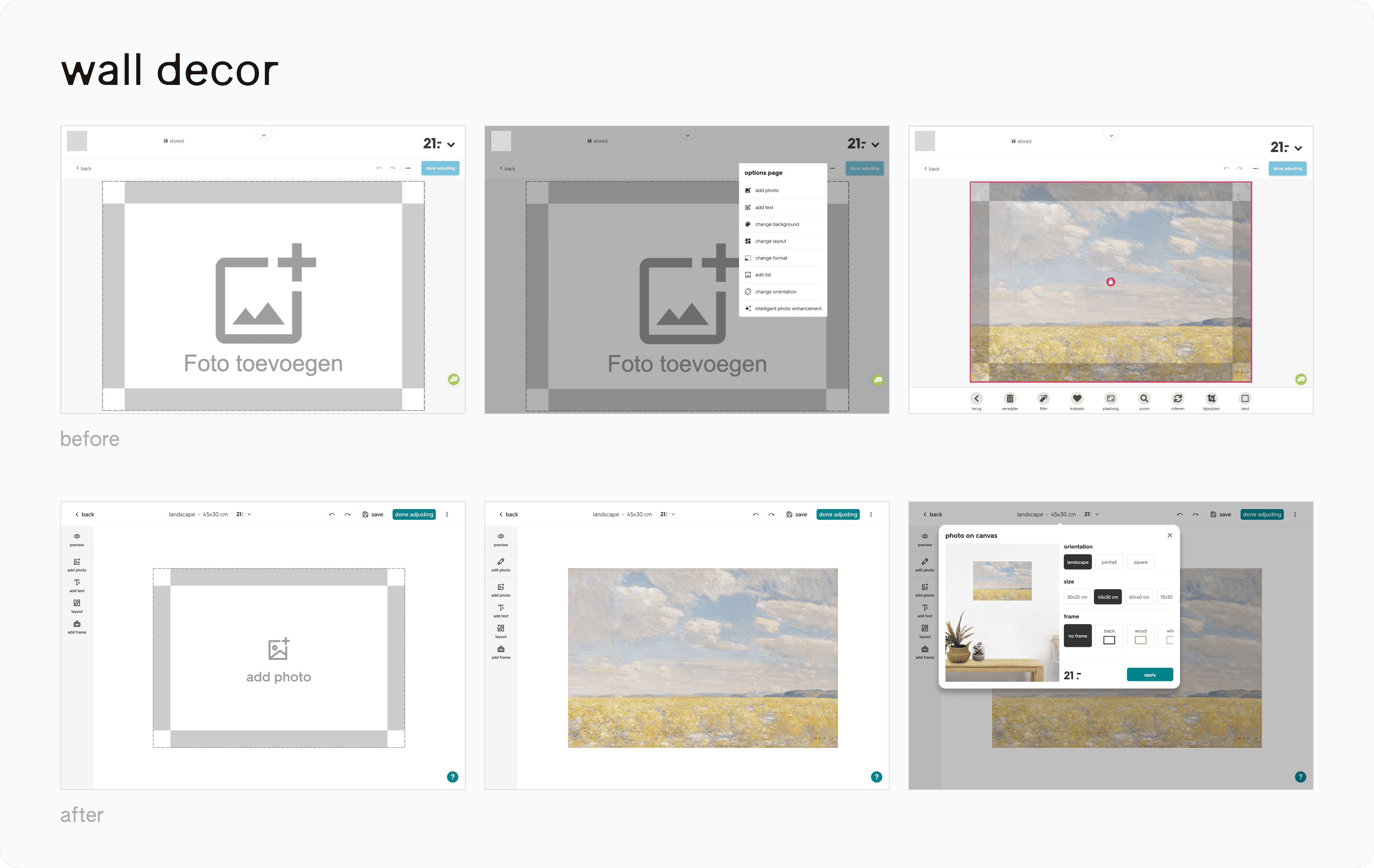
Like infinite canvas tools, photo editors are interaction-dense by nature so it was important to think about how every feature competes for attention within a constrained workspace, how states communicate, and how complexity is layered without overwhelming the user
final Deliverables
After many rounds of iterations and reviews with the team, two variations of the editors was created — one for photo prints and another for photo gifts with both dark and light themes. In the interim period, photobooks are utilizing the intermediate variation due to new prioritization to pause the redesign of the more advanced variation.
Takeaways and Reflections
Before joining the team, I had limited knowledge of design facilitation and balancing design feedback against legacy processes, existing client partner dependencies, and historically embedded product decisions. This role pushed me to deeply deconstruct the editor, examining each feature and questioning the mental models behind interactions of features that often get unnoticed. I learned to pick my battles, embrace KISS — keep it simple stupid and to don't reinvent the wheel where it's not needed. I recognized that every design decision involves tradeoffs and great design is defined by judgement developed through time and experience. Other key learnings involved — asking better clarifying questions, recognizing the conditions of the existing system (business standpoint) to help evolve and future-proof designs, using hi-fi prototypes in ideation and presentation of ideas to get stakeholder buy-in and test driving interaction flow, and finally to be proactive in managing up. Now I take the lessons I've learned with me to everything I work on!